Colour plays a vital role in the world of art and design. It influences perception, creates moods, and can profoundly affect how an artwork or a design is interpreted. Whether you are a painter, graphic designer, interior stylist, or branding expert, a deep understanding of colours and how they interact is essential for effective visual communication.
1. The Basics of Colour Theory
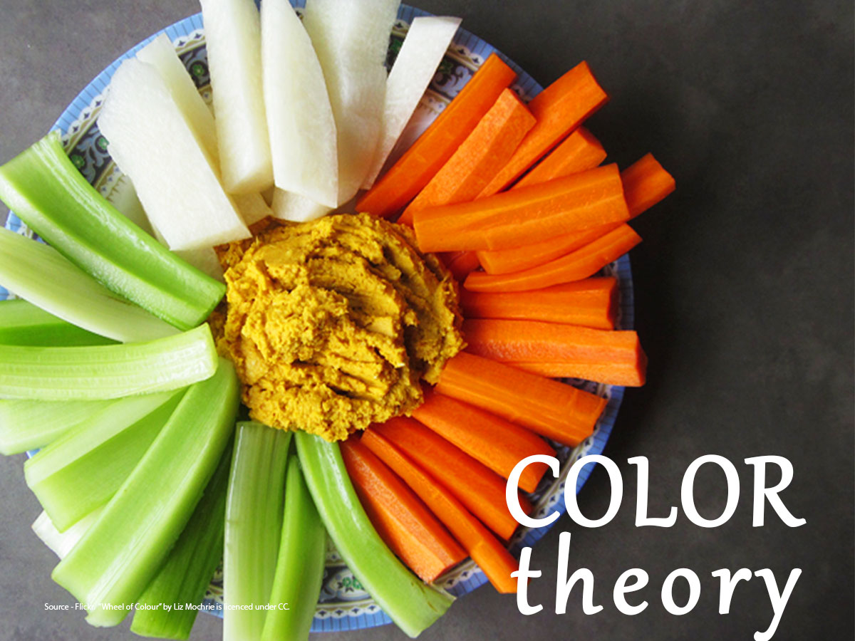
Colour theory is the foundation of visual arts and design. At its core is the colour wheel, a circular diagram invented by Sir Isaac Newton in the 17th century, which shows the relationship between colours.
The colour wheel is typically divided into three main categories:
- Primary Colours: Red, Blue, and Yellow. These cannot be created by mixing other colours.
- Secondary Colours: Green, Orange, and Purple. These are made by mixing two primary colours.
- Tertiary Colours: These are created by mixing a primary and a secondary colour (e.g., red-orange, yellow-green).
Understanding these categories is crucial for creating harmonious colour combinations.
2. Colour Harmonies
Colour harmony refers to aesthetically pleasing colour combinations. Here are some common types:
- Complementary: Colours opposite each other on the colour wheel (e.g., blue and orange). They create high contrast and vibrant looks.
- Analogous: Colours next to each other on the wheel (e.g., blue, blue-green, and green). These create serene and comfortable designs.
- Triadic: Three colours evenly spaced on the wheel (e.g., red, yellow, and blue). This scheme is balanced and rich.
- Split-Complementary: A base colour and two adjacent to its complement (e.g., blue, yellow-orange, and red-orange). It offers contrast with less tension.
- Monochromatic: Variations in lightness and saturation of a single colour. It’s subtle and cohesive.
Designers use these harmonies to create specific moods and to guide viewers’ emotional responses.
3. Warm vs. Cool Colours
Colours are often categorized by temperature:
- Warm Colours: Red, orange, and yellow tones evoke warmth, energy, and excitement. They tend to advance in space, making them good for drawing attention.
- Cool Colours: Blue, green, and violet tones suggest calmness, serenity, and professionalism. They recede in space, offering depth and relaxation.
Understanding colour temperature is essential in interior design, landscape painting, branding, and fashion, as it affects how a space or object feels.
4. The Psychology of Colour
Colours are more than visual tools; they convey psychological meanings. While interpretations can be subjective and culturally specific, general associations include:
- Red: Passion, urgency, danger, love
- Blue: Trust, calmness, intelligence, stability
- Yellow: Joy, energy, caution, creativity
- Green: Nature, growth, health, balance
- Purple: Luxury, mystery, spirituality
- Orange: Warmth, enthusiasm, fun
- Black: Power, sophistication, mourning
- White: Purity, simplicity, cleanliness
Brands and artists use colour psychology to connect with audiences on a deeper, emotional level.
5. Colour in Digital and Print Media
The way colours are displayed differs between digital screens and print media:
- RGB (Red, Green, Blue): Used for digital displays. These colours combine light to form other colours. Adding all three at full intensity produces white.
- CMYK (Cyan, Magenta, Yellow, Black): Used in print. These are subtractive colours, meaning they absorb light. Combining all results in black.
When designing for cross-media applications, it’s essential to understand how colour modes and profiles work to ensure consistency and accuracy.
6. Colour Value, Hue, Saturation, and Tint
These four characteristics define any colour:
- Hue: The name of the colour (e.g., red, blue, green).
- Value: The lightness or darkness of a colour. Adding black creates a shade; adding white creates a tint.
- Saturation (or Chroma): The intensity or purity of the colour. High saturation equals vivid colour, while low saturation appears muted.
- Tone: A colour mixed with grey, affecting both saturation and value.
Mastering these variables allows artists and designers to add depth, emphasis, and mood to their work.
7. Cultural and Contextual Influences
Cultural background greatly influences colour perception. For instance:
- White symbolizes purity in Western cultures but can represent mourning in some Eastern traditions.
- Red represents luck and celebration in China but may signify warning or aggression elsewhere.
Designers working for global audiences must be mindful of cultural connotations to avoid miscommunication or offense.
8. Using Colour in Different Design Fields
Graphic Design
Colour is vital for branding, website design, and advertising. A brand’s colour palette can become its identity. Think of Coca-Cola’s red or Facebook’s blue. Designers use colour to draw attention, guide navigation, and influence user behavior.
Interior Design
Colours impact spatial perception and ambiance. Light tones can make small rooms feel bigger, while dark colours add coziness. Accent walls, fabric choices, and lighting also play a part in how colour is experienced in a space.
Fashion Design
Colour trends often reflect broader cultural shifts. Designers must anticipate seasonal palettes and understand how colours interact with skin tones, fabrics, and accessories.
Fine Art
Artists use colour for expression, symbolism, and narrative. Impressionists like Monet explored the interplay of light and colour, while abstract artists like Rothko used colour fields to evoke deep emotional responses.
9. Tools and Resources for Working with Colour
Designers and artists rely on various tools to manage colour:
- Adobe Color: Online tool for creating colour schemes.
- Pantone Matching System (PMS): Standardized colour system used in branding and print.
- Colour Pickers: Found in most design software (e.g., Photoshop, Illustrator) for choosing and adjusting hues.
- Swatch Books: Physical references for accurate colour matching in print and fabric.
Understanding how to use these resources helps ensure consistent and intentional colour choices.
10. Tips for Mastering Colour Use
- Start with a Limited Palette: Fewer colours can lead to more cohesive designs.
- Test in Different Lights: Colour can appear differently in daylight, fluorescent, and screen lighting.
- Use Contrast Wisely: High contrast improves readability; low contrast creates subtlety.
- Learn from Nature and Art History: Study how masters use colour.
- Keep Accessibility in Mind: Use tools like contrast checkers to ensure readability for colour-blind users.
Colour is both an art and a science. Its thoughtful use can elevate any piece of design or art, influencing how it’s understood, felt, and remembered. By grasping the fundamentals of colour theory, understanding psychological and cultural implications, and practicing intentional combinations, artists and designers can communicate more powerfully through their work.
Whether you are creating a painting, branding a business, designing a website, or decorating a home, colour is your most versatile and emotive tool. Use it wisely, and it will speak volumes.